But we don’t usually approach friendship like dating. Bumble BFF is in need of a re-design:
Swiping for friends is weird
People are looking for specific things
• Swiping requires users to decide on a match immediately without seeing other profiles
• Only people of the same gender can become friends
• It’s only possible to match with people individually
• Users have only a limited ability to personalize their friend search
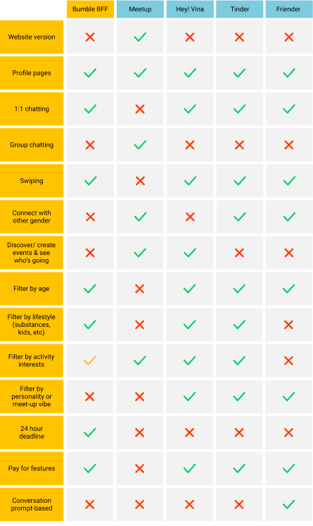
Competitive Analysis
We conducted a competitive analysis to understand Bumble’s market position and draw inspiration. It revealed that Bumble BFF’s friend matching system was sub-par and there was opportunity to expand into group meet-ups.
User Interviews
Through interviews, we learned about how people make friends. We also found out about their interactions (or lack thereof) with friendship making apps.
We discovered that people are particular about the vibe, interests, and values of potential friends. Many people expressed awkwardness about early one-on-one hang outs. Most had made their best friends over time by doing things together in groups.
Drawing from our research, our designs answered two key questions.
Question 1: How might we help people find friends with matching activity preferences, schedules, values and personalities?
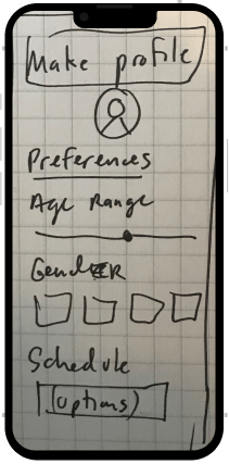
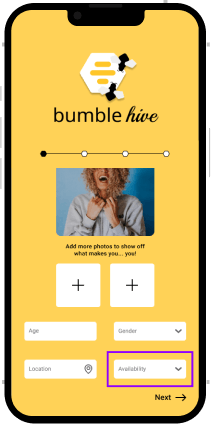
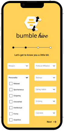
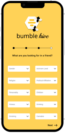
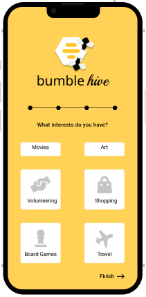
Our answer: My teammate Deanna created a new onboarding process, where you can now do the following:
Set your schedule:
Tell us about your values and personality:
Let us know what you are looking for in a friend:
Select your interests:
Question 2: How might we remove stress-points in the friend-making process and draw from real-life successes?
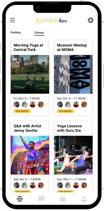
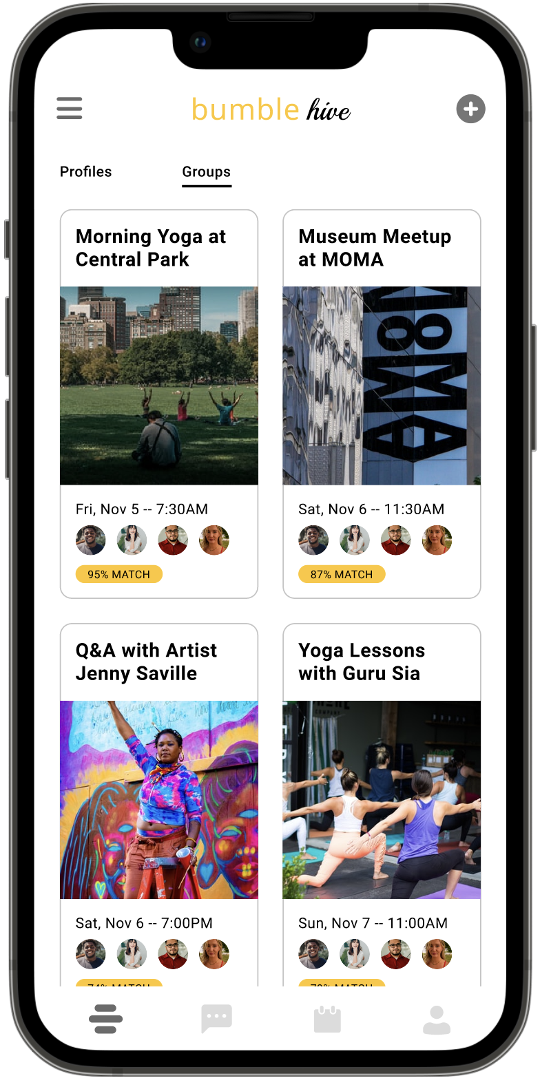
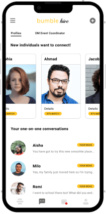
Our answer: Now you can make friends through group events:
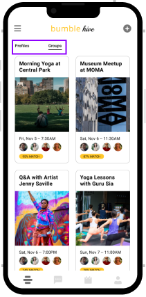
Toggle between profiles and groups:
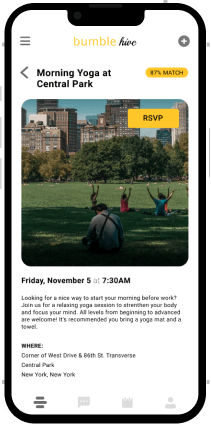
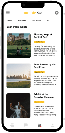
Browse through group events:
See who is going:
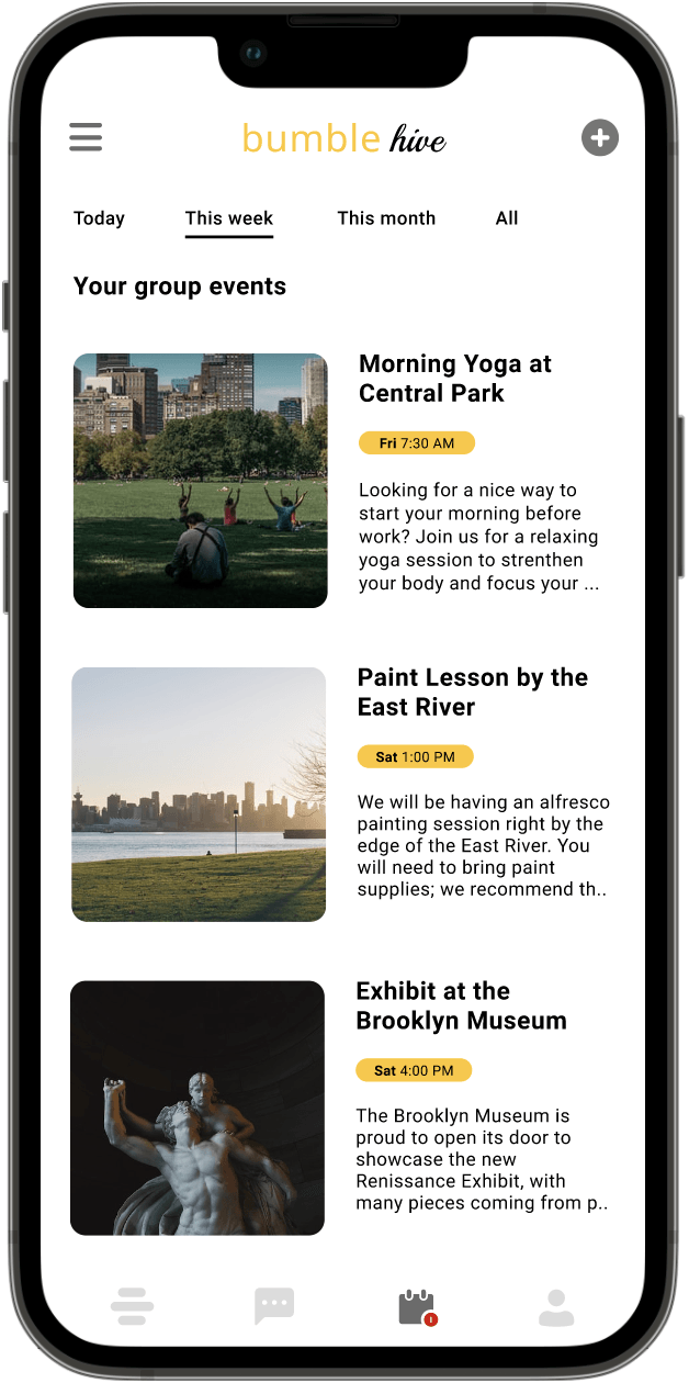
Add the event to your calendar:
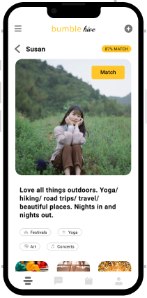
And you can still connect with individuals, but now with less stress:
Say goodbye to swiping
Now, you no longer have the stressful binary choice to accept or reject. If you want to connect with someone, you can start chatting! If you are not ready, you can keep browsing and come back.
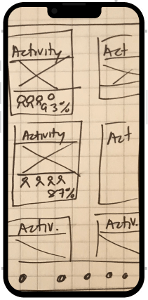
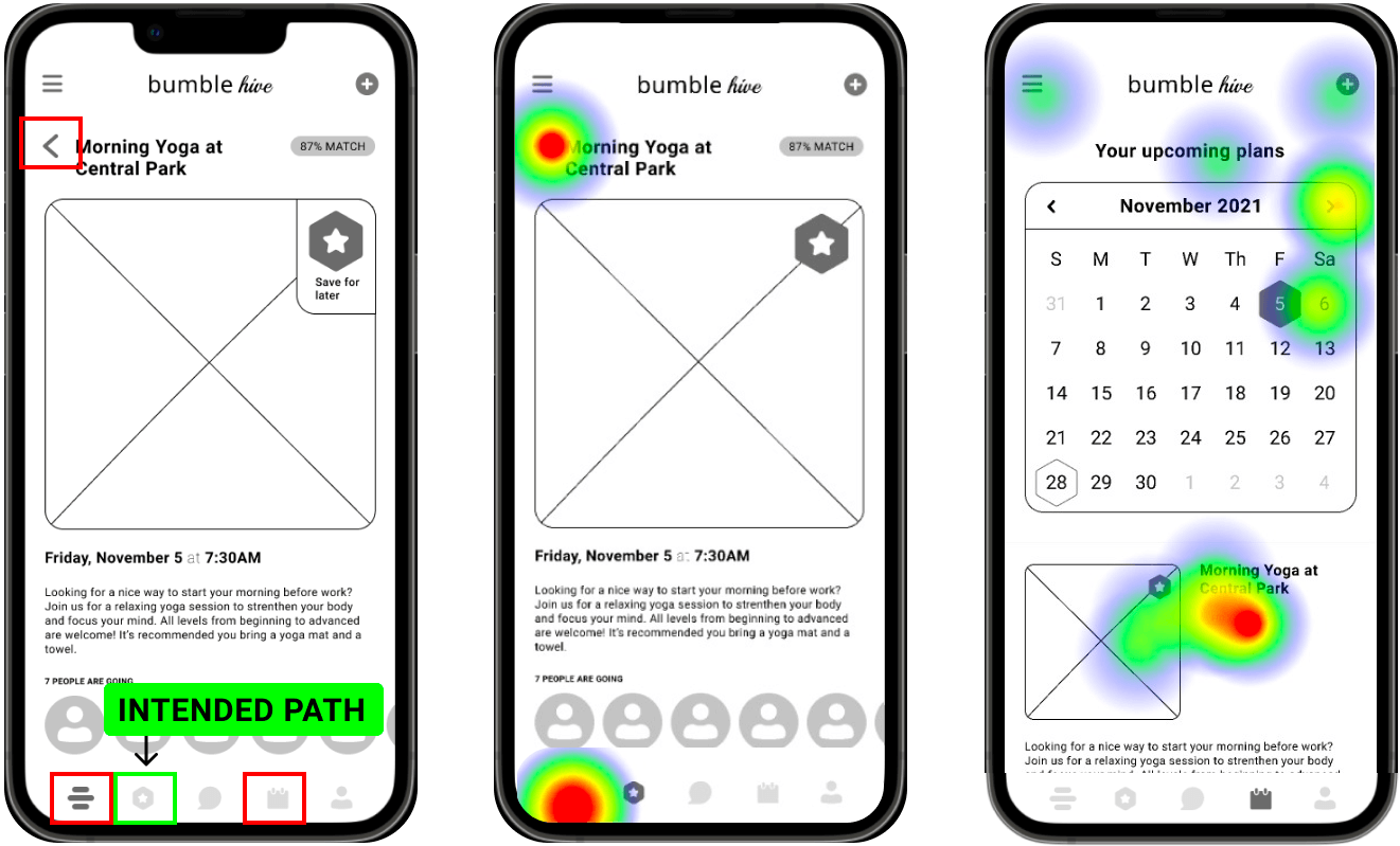
To test the app, we gave people a number of tasks. While they easily completed onboarding and knew where to chat with matches, it became clear that an overhaul of the navigation and some key features and was necessary. In particular, users got lost when asked the following: “Find a group activity in the park, favorite it, and commit to attending it.”
Originally, users were able to favorite profiles and group events before deciding to officially match with or attend them. The rationale was that this extra step would alleviate the pressure of prematurely making a decision. We learned that this additional level of complexity was confusing. To the right, you can see that, instead of following the intended path
(green), users got lost
(red). The heat map gives details on where they clicked instead.
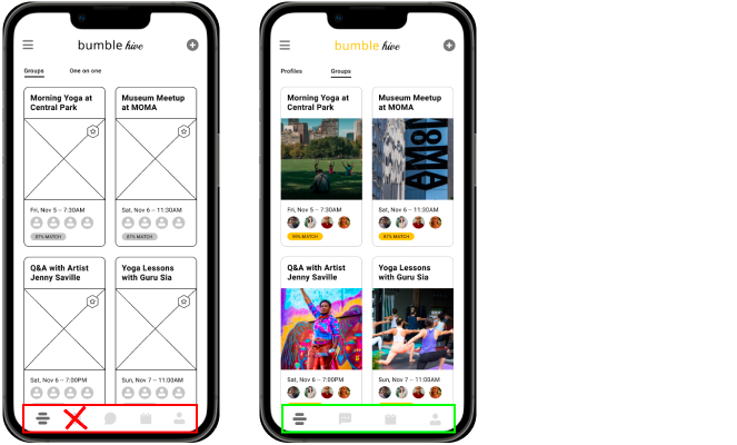
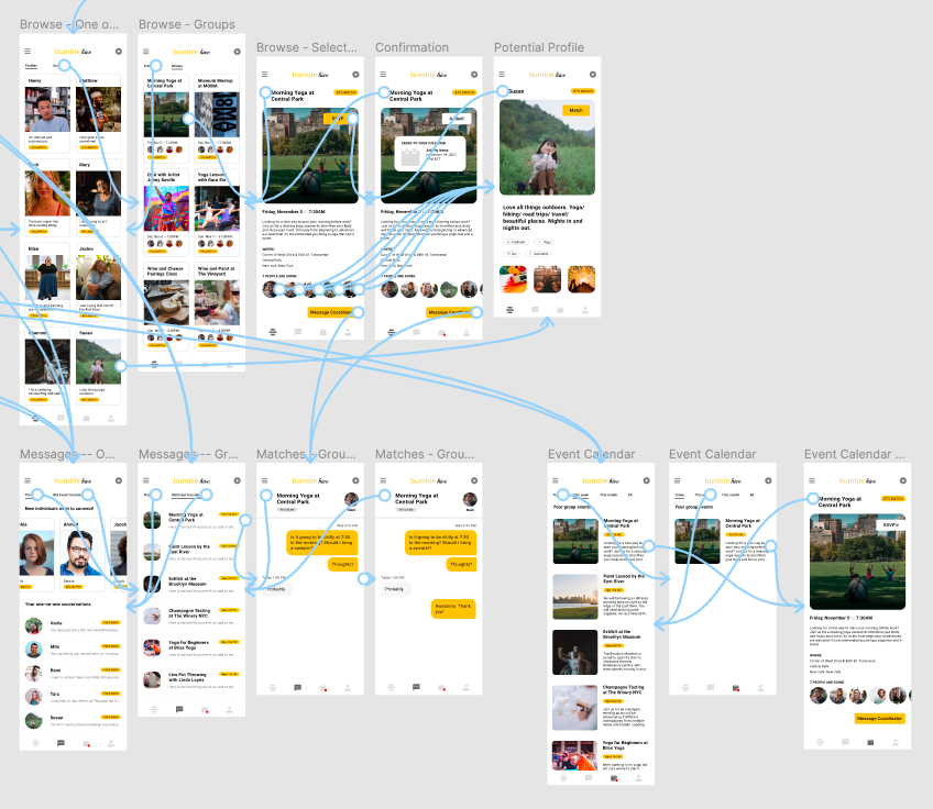
With this in mind, I went back to the drawing board and proposed a simplified user flow. I hypothesized that users would prefer an app architecture centered around their goals -- connecting with other Profiles and Group Events -- rather than the process of friend-making.
Along with this, I drew from our research to propose a number of other modifications.
In a second round of usability tests, participants were generally able to easily complete tasks. The revised designs checked out!
My mobile site is still under construction. Please see the desktop version for details on this project. Apologies for the inconvenience!
While it made for some long nights, I found it refreshing to create an entire product in such a short time frame.
Professionally, I have never worked with a style guide. On this concept project, I enjoyed improving something that was already developed.